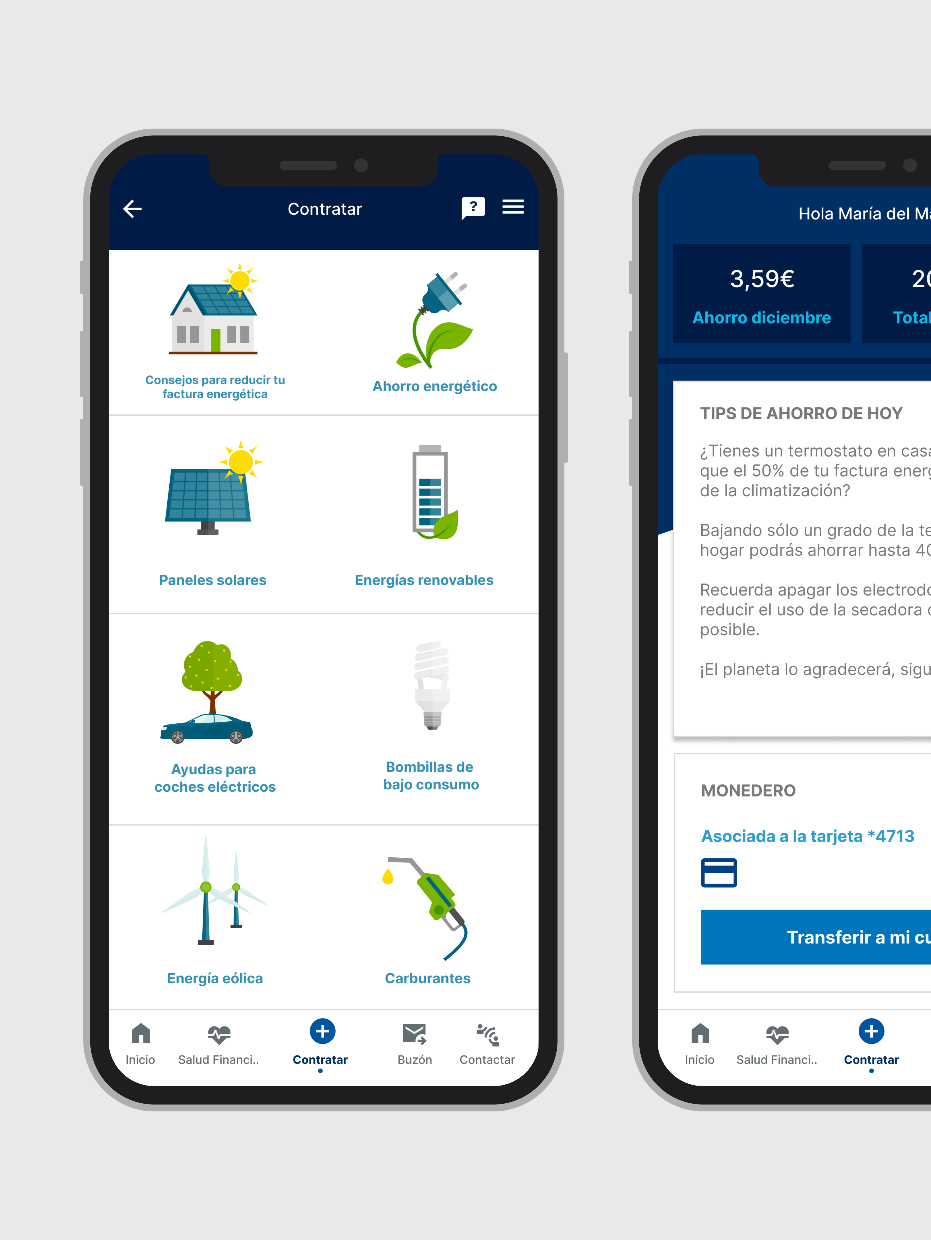
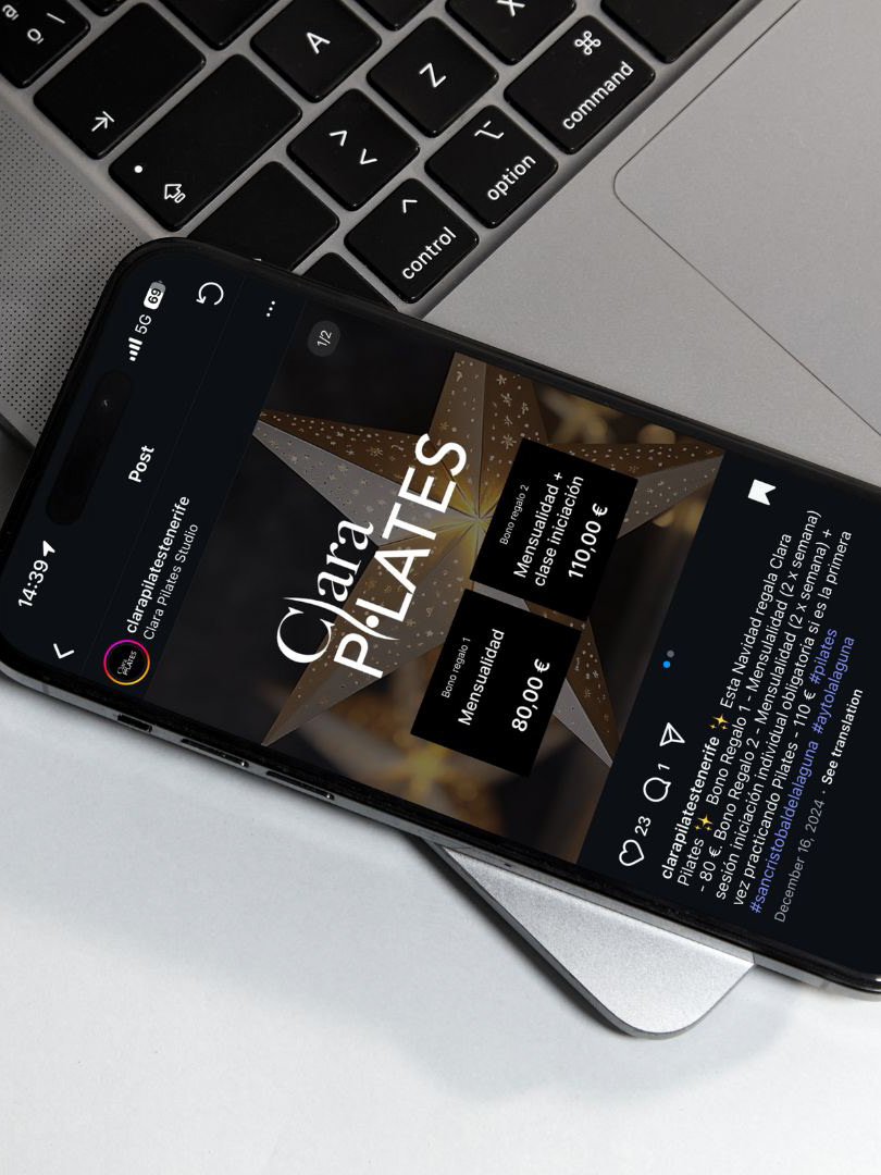
A key improvement was the clear separation of the two available services, allowing users to easily understand the differences between them. This was achieved through the use of icons and visual cues that help guide decision-making.
By focusing on clarity and usability, the new design helps users feel more confident in choosing the service that best fits their needs.

